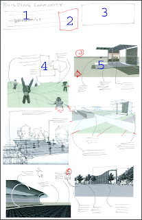
 1 - 'building community' paragraph explaining this concept more in depth.
2 - a diagram showing the site within the context of the neighborhood overlayed with the paths and highlighting where community can access the site.
3- title block - we might want to add a line to the title block talking about how our team made a pact to blow the whole $1000 prize in one night on booze and narcotics in old mexico.
4 - callouts of the unique feature embedded into the images. ie: the different green materials, the raised planters for old farts, restored native landscapes
5- hot graphics
3 comments:
i like the feeling. I would like to see more of a mixture of different graphic techniques. I am afraid of an entire board of these similiarly rendered perspecitves may be a bit boring. Perhaps with diagrams mixed in? David had the idea that maybe the images themselves break out of their rectangle so they don't seam so rigid. Like they do on the top. (i.e. a kids arm flying out into the white)
i think breaking out of their rectangle is really important. all the boards would read much lighter and more eloquently if this was the case. i think the only real defined boarder on any of the boards should be where the outline of the site is being shown
i agree with john, but i think we should even eliminate the site boarder line also, it is not even real. if anyone has reconmendation besides just comments i would recommend doing a quick sketch of how you would change it.
Post a Comment